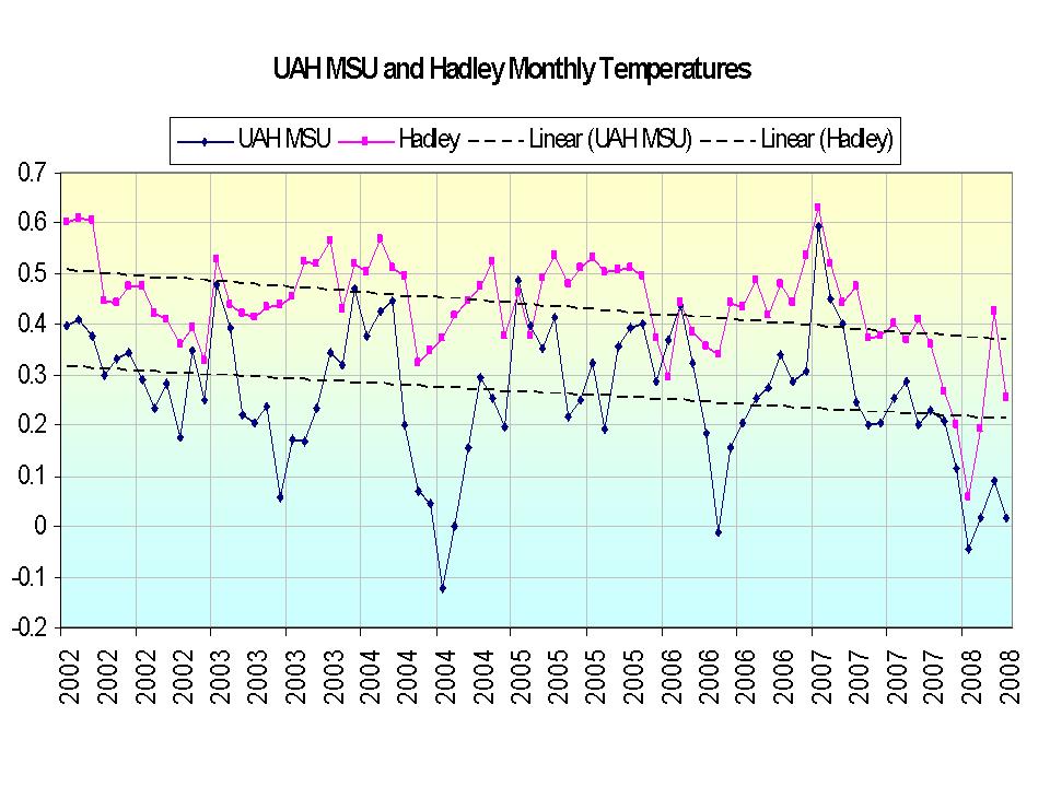
I have no way to verify the accuracy of these graphs--but they rather fit with a lot of what I have posted here over the last several years about global warming. For example, this graph showing global temperature data for the last few years:

The dashed lines are the trend line--downward.
A much more detailed report is here showing that while CO2 concentrations keep rising since 1998--there is no statistically significant temperature rise to go along with it. Now, this doesn't prove that CO2 has no effect on global temperatures. But it does make you ask why rising CO2 levels aren't having a measurable effect over this time period. Maybe the effect is far less than the global warming claimers want to believe. Maybe it is being overwhelmed by some other change (hint: solar output changes). But it should make you very skeptical that the global warming claimers have it right.
No comments:
Post a Comment